Python Matplotlib Tips
The ways to draw efficient and beautiful figures using python + matplotlib.
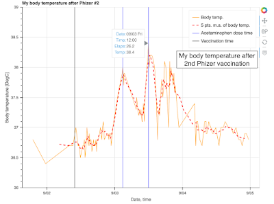
Visualize my body temperature after 2nd Phizer vaccination using Python+Bokeh
The result is:
Here is my body temperature data after the 2nd Phizer vaccination at 09:50 AM, Sep. 2, 2021. Sample numbers are 1. Sample profiles are age: 20-30, sex: male, nationality: Japan. The maximum body temperature, observed at 26.2 hours after the vaccination, was 38.4 DegC.
Backupy: Backup files from local machine to NAS and cloud using backupy and python
The concept is:
Backup is important. There are many backup tools in the world. There are also a backup manager tool written in python. This page presents an example of runnning backupy.
TarManager: combine many pickle files into some tar files using Python
The concept is:
This page shows how to combine many pickle files into some tar, tar.gz, or tar.xz using Python. In some simulations, we generate thousands and millions of output files for varying some parameters and some values for each parameters. The problem of such huge number of small files is the difficulty to handle on making backup to NAS, external HDD, and cloud storage services.
Draw multiple axhlines and axvlines in one function using Python & Matplotlib
The result is:
This page shows how to draw multiple axhlines and axvlines in one function using python and matplotlib.
Convert color pdf to grayscale pdf using Python & Matplotlib via Ghostscript
This page shows how to convert color pdf figures generated by python and matplotlib into grayscale pdf via Ghostscript.
Plot 12-bit tiff image with log scale colorbar using python & matplotlib.pyplot
The result is:
Some of the output data from measuring equipment have 12-bit unsigned int data. In some case, tiff format is used to ensure the convenience of the users. Reading the 12-bit tiff file and plotting the 12-bit tiff file is very easy. In addition, you can increase the visibility of the output figure by using log scale colormap when you plotting the tiff file. This page shows how to plot 12-bit tiff file in log scale using python and matplotlib.pyplot. 2D gaussian distribution is used as an example data.
Draw two axis to one colorbar using python and matplotlib.pyplot
The result is:
In my post in 14th, Oct. 2018, I showed how to draw second tick axis on the colorbar. The method of plotting is not so good, so I'd like to show an improved way to draw second tick axis on the colorbar. This page shows how to draw two axis to one colorbar using python and matplotlib.pyplot. By adapting twinx to the colorbar axis and by shifting the position of labels and ticks, you can draw an figure like the example on this page.
Combine three 2D colorap in one figure using Python and Matplotlib.pyplot
The result is:
If you want to plot three 2D colormaps on one figure, the only feasible way is combining these three colormaps to one image. This can be achieved by corresponding three values to three primary elements, i.e. red, green, blue. However, interpretation of the completed figure is quite complex, and easiness of understanding for readers would be decreased. In my opinion, this way for plotting should be avoided.
Listing up sequential 2D colormap with one common colorbar using python and matplotlib.pyplot
The concept is:
When you want to show a 2D colormap in a sequence, the simplest way to do it is just listing up the output figure like the left side of the above image. However, common information, that is xticks and colorbars, should be omitted to show useful colormap as large as possible. This page shows how to align 2D colormaps without useless information. Three figures are drawn sequentially: 1. full image, 2. without colorbar, and 3. witiout colorbar and xticks. A standalone colorbar will be drawn, plotted and saved at the first iteration of the sequence. By properly selecting the output figure on your tools such as LaTex or Microsoft Office, you can obtain the figure like the right side of the above image.
Draw three colormap with two colorbar using python and matplotlib.pyplot
The result is:
This page shows an example of how to arrange three colormap with two colorbar. One colorbar corresponds two colormaps, while the other corresponds to one colormap. Gridspec enables us to properly adjust these positions in the figure.
Subscribe to:
Comments (Atom)


