Pcolor with cut data below lower limit using Python and matplotlib.pyplot


The result is:

This page shows how to generate pcolor graph with a data whose small values below minimum limit are cut using python and matplotlib.

This page shows how to generate pcolor graph with a data whose small values below minimum limit are cut using python and matplotlib.

Convert x value to symlog scale with zero shift using Python and matplotlib.pyplot


The result is:

Convert x value to symlog scale with zero shift using Python and matplotlib.pyplot

This code shows how to convert x value to symlog scale with zero shift using Python and matplotlib.pyplot

Two ways to align ylabels for two plots using Python and matplotlib.pyplot


The result is:

Two ways to align ylabels for two plots using Python and matplotlib.pyplot

This page shows two ways to align two ylabels for two subplots using Python and matplotlib.pyplot.

Generate figure with just only table using Python and matplotlib.pyplot


The result is:

Generate figure with just only table using Python and matplotlib.pyplot

This code shows how to generate a figure with just only a table using Python and matplotlib.pyplot

Generate network graph using Python and matplotlib.pyplot


The result is:


This page shows how to generate network graph using Python, matplotlib.pyplot and networkx.

Combine two figures with/without spines and ticks using Python and matplotlib.pyplot


The result is:

Combine two figures with/without spines and ticks using Python and matplotlib.pyplot

This code shows how to combine two figures with and without spines and ticks using Python and matplotlib.pyplot.

Remove ticks and spines (box around figure) using Python and maptlotlib.pyplot


The result is:

Remove ticks and spines (box around figure) using Python and maptlotlib.pyplot

This page shows how to remove ticks and spines (box around figure) using Python and matplotlib.pyplot.

Interactive figure with several 1D plot and one hovertools using Python and Bokeh


The result is:

Interactive figure with several 1D plot and one hovertools using Python and Bokeh

This code how to generate interactive figure with several 1D plot, one hovertools and togglable legend using Python and Bokeh. This is a continuing post of last one.

Interactive figure with several 1D plot and several hovertools using Python and Bokeh


The result is:

Interactive figure with several 1D plot and several hovertools using Python and Bokeh

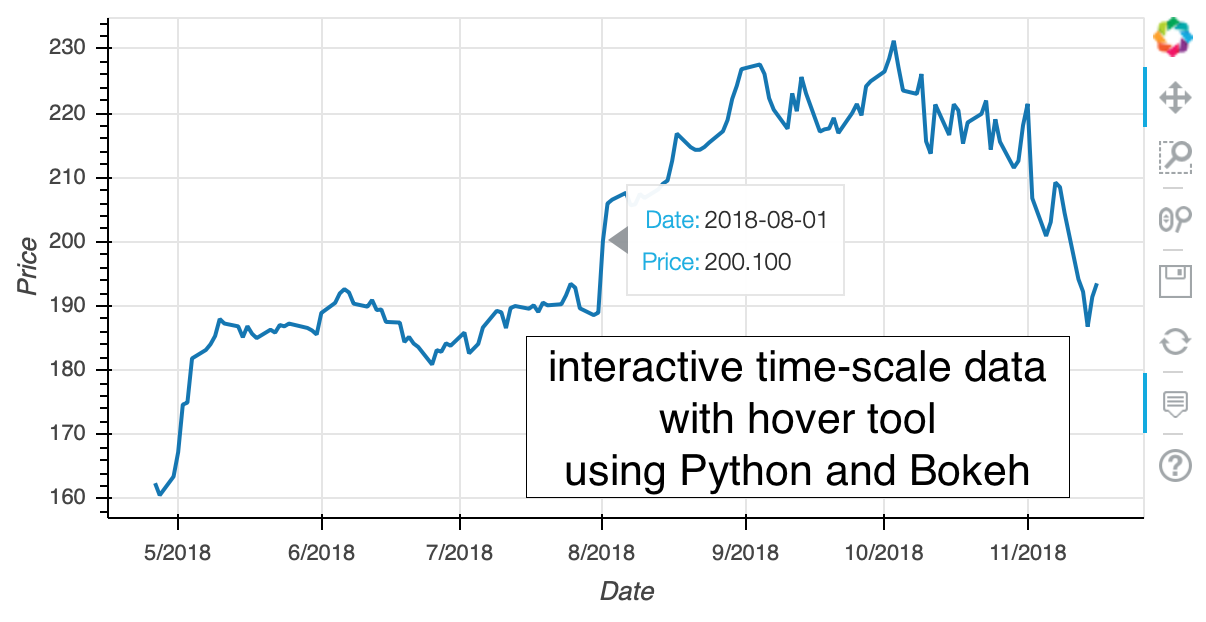
This page shows how to generate interactive figure with several 1D plot and several hovertools using Python and Bokeh. The way to merge hovertools will be shown in the next post.

Interactive 1D time-scale plot with hovertool using Python and Bokeh


The result (static image) is:

Interactive 1D time-scale plot with hovertool using Python and Bokeh

This page shows how to generate interactive time-scale 1D line plot with hovertool (stock data) using Python and Bokeh.

Two-dimensional interactive contour plot with colorbar using Python and Bokeh


The result is:

Two-dimensional interactive contour plot with colorbar using Python and Bokeh

Add linear colorbar to the contourf using Python and Bokeh.

Two-dimensional interactive contour plot using Python and Bokeh


The result is:

Two-dimensional interactive contour plot using Python and Bokeh

Bokeh is powerful plotting tools using nodejs. Although this code doesn't use matplotlib, I want to introduce how to generate 2D interactive contour plot using Bokeh.

Interactive plot using Bokeh - first step -


The result (static image) is:

Interactive plot using Bokeh - first step -

I firstly thought that Bokeh uses matplotlib. We generate figure using matplotlib then convert the figure to the Bokeh compatible. However, it seems Bokeh works stand alone without matplotlib (is it true?) Anyway, let's check whether Bokeh works in my environment or not.

Interactive time-scale stock price figure using Python, matplotlib.pyplot and mpld3


The result (static image) is:

Interactive time-scale stock price figure using Python, matplotlib.pyplot and mpld3

This page shows how to generate interactive figure using python, matplotlib.pyplot and mpld3. The stock information of the apple.inc is used as the example to plot.

Interactive figure with interactive legend using Python, matplotlib.pyplot and mpld3


The result (static image) is:

Interactive figure with interactive legend using Python, matplotlib.pyplot and mpld3

This page shows how to plot data in interactive figure using python, matplotlib.pyplot and mpld3. A interactive legend is added to the figure.

Animate 3D wireframe using animation.FuncAnimation in Python and maptlotlib.pyplot


The result is:

Animate 3D wireframe using animation.FuncAnimation in Python and maptlotlib.pyplot

This page shows how to animate 3D wireframe figure using animation.FuncAnimation in Python and matplotlib.pyplot.

Generate animation of 3D surface plot using plot_surface and animation.ArtistAnimation in Python and matplotlib.pyplot


The result is:

Generate animation of 3D surface plot using plot_surface and animation.ArtistAnimation in Python and matplotlib.pyplot

This page shows how to generate an animation of 3D surface plot using plot_surface and animation.ArtistAnimation in python and matplotlib.pyplot.

Generate animation of 3D surface plot using plot_surface and animation.FuncAnimation in Python and matplotlib.pyplot


The result is:

Generate animation of 3D surface plot using plot_surface and animation.FuncAnimation in Python and matplotlib.pyplot


This page shows how to generate an animation of 3D surface plot using plot_surface and animation.Funcanimation in python and matplotlib.pyplot.

Generate 3D scatter animation using animation.FuncAnimation in Python and matplotlib.pyplot


The result is:

Generate 3D scatter animation using animation.FuncAnimation in Python and matplotlib.pyplot

This page shows how to generate 3D animation of scatter plot using animation.FuncAnimation, python, and matplotlib.pyplot.

Generate normalized stacked barplot with sample number and percentage using Python and matplotlib.pyplot


The result is:

Generate normalized stacked barplot with sample number and percentage using Python and matplotlib.pyplot

This page shows how to generate normalized stacked barplot with sample number of each bar and percentage of each data using python and matplotlib.pyplot.

Add sample number to stacked barplot using Python and matplotlib.pyplot


The result is:

Add sample number to stacked barplot using Python and matplotlib.pyplot


This page shows how to add sample number to stacked barplot using Python and matplotlib.pyplot.

Combine two contourf and one colorbar into one figure using Python and matplotlib.pyplot


The result is:
Combine two contourf and one colorbar into one figure using Python and matplotlib.pyplot

This page shows how to combine two contourf and one colorbar into one figure using python and matplotlib.pyplot.

Generate stacked barplot using Python and matplotlib.pyplot


The result is:

Generate stacked barplot using Python and matplotlib.pyplot

This page shows how to generate stacked barplot using Python and matplotlib.pyplot.

Plot contour figure from data which has large scale and plus-minus difference with minimum limit using Python and matplotlib.pyplot


The result is:

Plot contour figure from data which has large scale and plus-minus difference with minimum limit using Python and matplotlib.pyplot

This page shows my suggestion to generate contour figure from data which has large scale and plus-minus difference using python and matplotlib.pyplot. The minimum value and maximum value can be specified in this code.

Increase box size of the legend for barplot using Python and matplotlib.pyplot


The result is:

Increase box size of the legend for barplot using Python and matplotlib.pyplo

This page shows how to increase box size of the legend for barplots using Python and matplotlib.pyplot.

Decrease padding around annotation text using Python and matplotlib.pyplot


The result is:
This page shows how to decrease the padding around the annotation text using python and matplotlib.pyplot.

When you struggle to draw efficient figures, you sometimes think the padding around the annotation text is to big. This page shows how to decrease the padding around the annotation text using python and matplotlib.pyplot.

Combine two contourf and two colorbar into one figure using Python and matplotlib.pyplot


The result is:

Combine two contourf and two colorbar into one figure using Python and matplotlib.pyplot

This page shows how to combine two contourf and two colorbar into one figure using python and matplotlib.pyplot.

Combine multiple line plot and contour plot with a colorbar using Python and matplotlib.pyplot


The result is:
Combine multiple line plot and contour plot with a colorbar using Python and matplotlib.pyplot

This code shows how to combine multiple line plots and contour plots with a colorbar in one figure using Python and matplotlib.pyplot. To combine these plots, plt.subplots with gridspec_kw options are used. The xlims are also adjusted between upper and lower plots.

Animate zoomed plot of crowded data by updating xlim using matplotlib.animation.FuncAnimation


The result is:
Animate zoomed plot of crowded data by updating xlim using matplotlib.animation.Funcanimation

This code shows how to animate the zoomed subplot of original crowded subplot using Python and matplotlib.animation.Funcanimation.

Speed up generating figures by running external python script parallelly using Python and matplotlib.pyplot


The result is:

Speed up generating figures by running external python script parallelly using Python and matplotlib.pyplot

This page shows my suggestion to process data and generate figure parallelly by running some external python script.

Plot contour figure from data which has large scale and plus-minus difference using Python and matplotlib.pyplot


The result is:

Plot contour figure from data which has large scale and plus-minus difference using Python and matplotlib.pyplot modified

This page shows my suggestion to generate contour figure from data which has large scale and plus-minus difference using python and matplotlib.pyplot.

Draw second colorbar axis outside of first axis


The result is:
Draw second colorbar axis outside of first axis

This code shows how to draw second colorbar axis outside of first colorbar axis.

Plot 1D data which has large scale and plus-minus difference using Python and matplotlib.pyplot


The result is:

Plot 1D data which has large scale and plus-minus difference using Python and matplotlib.pyplot original
Plot 1D data which has large scale and plus-minus difference using Python and matplotlib.pyplot modified

This page shows my suggestion to generate 1D line figure from data which has large scale and plus-minus difference using python and matplotlib.pyplot.

Rotate azimuth angle and animate 3d plot_surface using Python and matplotlib.pyplot


The result is:

Rotate azimuth angle and animate 3d plot_surface using Python and matplotlib.pyplot

This page shows how to generate animation with rotating azimuth angle in the 3D surface plot using python, matplotlib.pyplot, and matplotlib.animation.FuncAnimation.

Rotate elevation angle and animate 3d plot_surface using Python and matplotlib.pyplot


The result is:

Rotate elevation angle and animate 3d plot_surface using Python and matplotlib.pyplot

This page shows how to generate animation with rotating elevation angle in the 3D surface plot using python, matplotlib.pyplot, and matplotlib.animation.FuncAnimation.

Compare plt.plot and plt.scatter in speed in Python and Matplotlib.pyplot


This page compares the speed of "plt.plot" and "plt.scatter" to generate same following figure:

Compare plt.plot and plt.scatter in speed in Python and Matplotlib.pyplot

It seems that "plt.plot" is faster than "plt.scatter" to plot simple and large point scatter plot.

Kernel density estimation using Python, matplotlib.pyplot and scipy.stats.gaussian_kde


The result is:

Kernel density estimation using Python, matplotlib.pyplot and scipy.stats.gaussian_kde

This page shows how to change the color of the scatter point according to the density of the surrounding points using python and scipy.stats.gaussian_kde and matplotlib.


Check the url is indexed by Google using Python


Check the url is indexed by Google using Python

Indexed by Google is crucial to increase the number of the visitor to the site. You can check whether the URL is indexed by Google or not using Python. This page shows how to do it for all blog posts. The URLs of the blog posts are extracted from the sitemap. So, you can use this code for your page by just modifying the sitemap URL. If you know how to use Heroku, crontab or such light resources which enable regularly execution of scripts, and if you know how to send an e-mail using python, you can report the indexed/not-indexed page for hourly, daily, weekly or whenever you want. The notebook below is the example of the indexed/not-indexed URL list when this post is written.


Add second x-axis below first x-axis using Python and matplotlib.pyplot


The result is:

Add second x-axis below first x-axis using Python and matplotlib.pyplot

This page shows how to draw second x-axis below the first x-axis. Using "twinx", "set_ticks_position", and "set_label_position", and "spines['bottom'].set_position", you can move the second x-axis from the top of the figure to below the first x-axis.

Add second x-axis at top of figure using Python and matplotlib.pyplot


The result is:

Add second x-axis at top of figure using Python and matplotlib.pyplot

This page shows how to add second x-axis at the top of the figure using python and matplotlib.pyplot. Using "twinx" funcion, you can add x-axis at the top of the figure.

Solve and animate single pendulum using scipy.odeint and matplotlib.animation.ArtistAnimation


The result is:

Solve and animate single pendulum using scipy.odeint and matplotlib.animation.ArtistAnimation

This page shows the example of the scipy.odeint function with solving the motion of the single pendulum. The result is converted to the animation using matplotlib.animation.ArtistAnimation.

Try using all mathtext fontset in python and matplotlib.pyplot


The result (computer modern: cm) is:

Try using all mathtext fontset in python and matplotlib.pyplot

In this page, I try using all mathtext fontset in python and matplotlib.pyplot. It seems that the resulting text of \mathbb{hogehoge}, \mathrm{\mathbb{hogehgoe}}, \mathfrak{hogehoge}, \mathsf{hogehoge}, and \mathrm{\mathsf{hogehoge}} are same.

Generate average image using Python and PIL (Python Image Library)


Generate average image using Python and PIL (Python Image Library)

This page shows how to generate an average image of the image arrays using python and PIL (python image library) module.
It is easy to do by converting the image to the numpy.array.


Combine 3D and two 2D animations in one figure using python, matplotlib.pyplot and animation.ArtistAnimation


The result is:


This page shows how to combine 3D and 2D animations in one figure using python, matplotlib.pyplot, and animation.artistanimation function.

Combine 3D and two 2D animations in one figure using python, matplotlib.pyplot and animation.timedanimation


The result is:

Combine 3D and two 2D animations in one figure using python, matplotlib.pyplot and animation.timedanimation

This page shows how to combine 3D and 2D animations in one figure using python, matplotlib.pyplot, and animation.timedanimation function.

Combine two 2D animations in one figure using python, matplotlib.pyplot and animation.artistanimation


The result is:

Combine two 2D animations in one figure using python, matplotlib.pyplot and animation.artistanimation

This code shows how to combine two 2D animations in one figure using python, matplotlib.pyplot, and matplotlib.animation.


Combine two 2D animations in one figure using python, matplotlib.pyplot and animation.timedanimation


The result is:

Combine two 2D animations in one figure using python, matplotlib.pyplot and animation.timedanimation

This code shows how to combine two 2D animations in one figure using python, matplotlib.pyplot, and matplotlib.animation.

Plot three wave in one plot; PWM wave as example


The result is:


This page shows an example of a plot with three waves in one axes using offsets. The PWM wave is the objective.