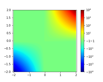
The result is:
This page shows my suggestion to generate contour figure from data which has large scale and plus-minus difference using python and matplotlib.pyplot.
To show data with large-scale difference, we must use a log scale. By using this simple way, we can deal with the plus and minus difference in log scale graph.
See also:
This page shows my suggestion to generate 1D line figure from data which has large scale and plus-minus difference using python and matplotlib.pyplot.
This page shows my suggestion to generate contour figure from data which has large scale and plus-minus difference using python and matplotlib.pyplot. The minimum value and maximum value can be specified in this code.
import numpy as np
import matplotlib.pyplot as plt
%matplotlib inline
xs = np.linspace(-2,2,100)
ys = np.linspace(-2,2,100)
XX,YY = np.meshgrid(xs,ys)
zs = 10**(XX*YY)
zs *= XX/np.abs(XX)
Original way to show this data
plt.figure(facecolor='w',figsize=(5,4))
plt.axes().set_aspect('equal', 'datalim')
plt.contourf(XX,YY,zs,100,cmap='jet')
cbar = plt.colorbar()
ctks = [-10000,-8000,-6000,-4000,-2000,0,2000,4000,6000,8000,10000]
cbar.set_ticks(ctks)
plt.savefig("pm_log1.png")
Convert raw data to log friendly data.
Unfortunately, values from -1.0 to 1.0 will be converted to 0.0.
This is because:
100 -> 2
10 -> 1
1 -> 0
0.1 -> -1 # not good
...
-0.1 -> abs() -> 0.1 -> -1 # not good
-1 -> abs() -> 0
-10 -> abs() -> 1
-100 -> abs() -> 2
pm_flag = zs/np.abs(zs)
zs = np.abs(zs)
zs[np.where(zs<1.0)] = 1.0
zs = np.log10(zs)
zs *= pm_flag
Improved way to show this data
plt.figure(facecolor='w',figsize=(5,4))
plt.axes().set_aspect('equal', 'datalim')
plt.contourf(XX,YY,zs,100,cmap='jet')
cbar = plt.colorbar()
ctks = [-4,-3,-2,-1,0,1,2,3,4]
ctkls = ["$-10^{%d}$"%(-v) for v in ctks[:4]] + ["$-1$~$1$"] + ["$10^{%d}$"%v for v in ctks[5:]]
# the label 0 should be in other way such as -1 to 1 or -1<v<1
cbar.set_ticks(ctks)
cbar.set_ticklabels(ctkls)
plt.savefig("pm_log2.png")


