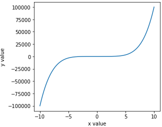
The result is:
This page shows my suggestion to generate 1D line figure from data which has large scale and plus-minus difference using python and matplotlib.pyplot.
To show data with large-scale difference, we must use a log scale. By using this simple way, we can deal with the plus and minus difference in log scale graph.
In [1]:
import matplotlib.pyplot as plt
import numpy as np
%matplotlib inline
In [2]:
plt.figure(facecolor='w',figsize=(4.5,4))
x = np.linspace(-10,10,1000)
y = x**5
plt.plot(x,y)
plt.xlabel('x value')
plt.ylabel('y value')
plt.savefig('pm_log_1d_1.png')
Try to plot in log scale and of cause it fails because the data contains minus value.
In [3]:
plt.figure(facecolor='w',figsize=(4.5,4))
plt.plot(x,np.log10(y))
plt.xlabel('x value')
plt.ylabel('y value (in log)')
plt.savefig('pm_log_1d_2.png')
Prepare tha data suitable for log scale.
YSHIFT is the difference between the position in figure and the value in log scale.
In [4]:
YSHIFT = 3
pm_flag = y/np.abs(y)
ylog = np.abs(y)
ylog *= 10**YSHIFT
ylog[np.where(ylog<1.0)] = 1.0
ylog = pm_flag * np.log10(ylog)
Plot the the data in log scale with plus and minus difference.
In [5]:
plt.figure(facecolor='w',figsize=(4.5,4))
plt.plot(x,ylog)
plt.plot(x,ylog*0,'k--',lw=0.5)
# y tick values in log scale
ytks1,ytks2,ytks3 = [-2,-1,0,1,2,3,4,5],[0],[-2,-1,0,1,2,3,4,5]
# y tick positions to show in graph
ytkps = [-v-YSHIFT for v in ytks1[::-1]]+ytks2+[v+YSHIFT for v in ytks3]
# y tkck lavels in str
ytkls = ['$-10^{%d}$'%(v) for v in ytks1[::-1]]+['']+['$10^{%d}$'%(v) for v in ytks3]
# specify position and label
plt.yticks(ytkps,ytkls)
plt.text(-10,0,'$-10^{%d}$~$10^{%d}$'%(-YSHIFT,-YSHIFT),va='bottom',ha='left')
plt.xlabel('x value')
plt.ylabel('y value (in log)')
plt.savefig('pm_log_1d_3.png')
You can also shift zero point upper and lower than center
In [6]:
plt.figure(facecolor='w',figsize=(4.5,4))
plt.plot(x,ylog)
plt.plot(x,ylog*0,'k--',lw=0.5)
# y tick values in log scale
ytks1,ytks2,ytks3 = [-2,-1,0,1,2,3,4,5],[0],[-2,-1,0,1,2,3,4,5]
# y tick positions to show in graph
ytkps = [-v-YSHIFT for v in ytks1[::-1]]+ytks2+[v+YSHIFT for v in ytks3]
# y tkck lavels in str
ytkls = ['$-10^{%d}$'%(v) for v in ytks1[::-1]]+['']+['$10^{%d}$'%(v) for v in ytks3]
# specify position and label
plt.yticks(ytkps,ytkls)
plt.text(-10,0,'$-10^{%d}$~$10^{%d}$'%(-YSHIFT,-YSHIFT),va='bottom',ha='left')
plt.xlabel('x value')
plt.ylabel('y value (in log)')
plt.ylim(-(-1+YSHIFT),5+YSHIFT)
plt.savefig('pm_log_1d_4.png')

