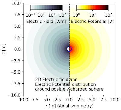
The result is:
This page shows how to combine two contourf and two colorbar into one figure using python and matplotlib.pyplot. The example is the axial symmetric model which has r-z coordinates. The z axis is the axis of symmetry. A charged sphere is placed at (r,z)=(0,0) and the electric potential and electric field is calculated and plotted into one figure. The right side of the figure is electric potential and the left side is electric field.
See also:
This page shows how to combine two contourf and one colorbar into one figure using python and matplotlib.pyplot. The example is the axial symmetric model which has r-z coordinates. The z axis is the axis of symmetry. A charged sphere is placed at (r,z)=(0,0) and electric field distribution around the sphere is calculated and plotted into a figure. The right side of the figure is electric potential in r direction, and the left side is electric field in z direction.
This code is based on the following web page:
- Demo Colorbar With Inset Locator - matplotlib.org - URL: https://matplotlib.org/gallery/axes_grid1/demo_colorbar_with_inset_locator.html#sphx-glr-gallery-axes-grid1-demo-colorbar-with-inset-locator-py
In [1]:
import matplotlib.pyplot as plt
import numpy as np
from mpl_toolkits.axes_grid1.inset_locator import inset_axes
Define constants
In [2]:
eps0 = 8.85*10**(-12) # permittivity of vacuum
rho_sp = 0.5          # radius of the sphere
Q_sp = 1.0*10**(-9)   # charge of the sphere
Generate two data (V: potential and E: field) to show in one figure.
In [3]:
Ndata = 1000
rs = np.linspace(10**(-12),10,Ndata)
zs = np.linspace(-10,10,Ndata)
RR,ZZ = np.meshgrid(rs,zs)

def funcV(rsp,q,x,y):
    rho = (x**2+y**2)**0.5
    v = q/(4*np.pi*eps0*(x**2+y**2)**0.5)
    vsp =q/(4*np.pi*eps0*rho_sp)
    v[np.where(rho<rsp)] = vsp
    return v
def funcE(rsp,q,x,y):
    rho = (x**2+y**2)**0.5
    e = q/(4*np.pi*eps0*(x**2+y**2))
    esp = 0
    e[np.where(rho<rsp)] = esp
    return e

VV = funcV(rho_sp, Q_sp, RR, ZZ)
EE = funcE(rho_sp, Q_sp, RR, ZZ)
Convert the data to log style
In [4]:
VVlog = VV.copy()
VVlog = np.log10(VV)
EElog = EE.copy()
EElog[np.where(EElog<10**(-12))] = 10**(-12)
EElog = np.log10(EElog)
Convert the data to figure
In [5]:
fig = plt.figure(facecolor='w')
ax = fig.add_subplot(1, 1, 1)
ax.set_aspect('equal')

# Right side of the figure which shows V: electric potential
cmin1 = 0
cmax1 = 2
lvls1 = np.linspace(cmin1, cmax1, 20)
cont1 = ax.contourf(RR, ZZ, VVlog, levels=lvls1, cmap='hot_r')
axin1 = inset_axes(ax, width='35%', height='5%', loc='upper right',
                  bbox_to_anchor=(-0.05,0,1,1), bbox_transform=ax.transAxes)
cbar1 = plt.colorbar(cont1, cax=axin1, orientation='horizontal')
cbar1.set_label('Electric Potential [V]')
cbar1.set_ticks([np.arange(cmin1, cmax1+0.001)])
cbar1.set_ticklabels([ "$10^{%d}$"%(int(x)) for x in cbar1.get_ticks()])

# Left side of the figure which shows E: electric field
cmin2 = -1
cmax2 = 2
lvls2 = np.linspace(cmin2, cmax2, 20)
cont2 = ax.contourf(-RR, ZZ, EElog, levels=lvls2, cmap='bone_r')
axin2 = inset_axes(ax, width='35%', height='5%', loc='upper left',
                  bbox_to_anchor=(+0.05,0,1,1), bbox_transform=ax.transAxes)
cbar2 = plt.colorbar(cont2, cax=axin2, orientation='horizontal')
cbar2.set_label('Electric Field [V/m]')
cbar2.set_ticks([np.arange(cmin2, cmax2+0.001)])
cbar2.set_ticklabels([ "$10^{%d}$"%(int(x)) for x in cbar2.get_ticks()])

# Additional data 1: a line to separate left side and right side
ax.plot([0,0], [-10,10], 'k--', lw=1)

# Additional data 2: shape of the spere
tsp = np.linspace(0, 2*np.pi, 100)
xsp = rho_sp*np.cos(tsp)
ysp = rho_sp*np.sin(tsp)
ax.plot(xsp,ysp,'b-',lw=1)

# Additional data 3: text
tx =  "2D Electric field and"+"\n"
tx += "Electric Potential distribution"+"\n"
tx += "around positiely charged sphere"
ax.text(-7.5, -9, tx)

# Set ticks and labels
xtks = ax.get_xticks()
ax.set_xticks(xtks)
ax.set_xticklabels(np.abs(xtks))
ax.set_xlabel('$r$ [m] (Axial symmetry)')
ax.set_ylabel('$z$ [m]')

# Save figure as png file
plt.savefig("two_contour_two_colorbar_in_one_figure.png",
            bbox_inches='tight', pad_inches=0.05, dpi=150)
plt.show()

