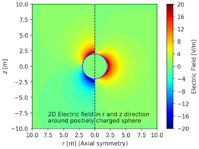
The result is:
This page shows how to combine two contourf and one colorbar into one figure using python and matplotlib.pyplot. The example is the axial symmetric model which has r-z coordinates. The z axis is the axis of symmetry. A charged sphere is placed at (r,z)=(0,0) and electric field distribution around the sphere is calculated and plotted into a figure. The right side of the figure is electric potential in r direction, and the left side is electric field in z direction.
See also:
This page shows how to combine two contourf and two colorbar into one figure using python and matplotlib.pyplot.
In [1]:
import matplotlib.pyplot as plt
import numpy as np
Define constants
In [2]:
eps0 = 8.85*10**(-12) # permittivity of vacuum
rho_sp = 2.0          # radius of the sphere
Q_sp = 1.0*10**(-8)   # charge of the sphere
Generate two data (Er: Electric field in r direction and Ez: Electric field in z direction) to show in one figure.
In [3]:
Ndata = 1000
rs = np.linspace(10**(-12),10,Ndata)
zs = np.linspace(-10,10,Ndata)
RR,ZZ = np.meshgrid(rs,zs)

def funcErz(rsp,q,x,y):
    rho = (x**2+y**2)**0.5
    e = q/(4*np.pi*eps0*(x**2+y**2))
    esp = 0
    e[np.where(rho<rsp)] = esp
    er = e*x/rho
    ez = e*y/rho
    return er,ez

Er,Ez = funcErz(rho_sp, Q_sp, RR, ZZ)
Convert the data to figure
In [4]:
fig = plt.figure(facecolor='w')
ax = fig.add_subplot(1, 1, 1)
ax.set_aspect('equal')

cmin = -20
cmax = 20
lvls = np.linspace(cmin, cmax, 50)

# Right side of the figure which shows V: electric potential
cont1 = ax.contourf(RR, ZZ, Er, levels=lvls, cmap='jet')
# Left side of the figure which shows E: electric field
cont2 = ax.contourf(-RR, ZZ, Ez, levels=lvls, cmap='jet')

# Plot one colorbar at the right side of the figure
cbar = plt.colorbar(cont1)
cbar.set_label('Electric Field [V/m]')
cbar.set_ticks([np.arange(cmin, cmax+0.001,4)])
# cbar.set_ticklabels([ "$10^{%d}$"%(int(x)) for x in cbar1.get_ticks()])

# Additional data 1: a line to separate left side and right side
ax.plot([0,0], [-10,10], 'k--', lw=1)

# Additional data 2: shape of the spere
tsp = np.linspace(0, 2*np.pi, 100)
xsp = rho_sp*np.cos(tsp)
ysp = rho_sp*np.sin(tsp)
ax.plot(xsp,ysp,'b-',lw=1)

# Additional data 3: text
tx =  "2D Electric field in r and z direction "+"\n"
tx += "around positiely charged sphere"
ax.text(-7.5, -9, tx)

# Set ticks and labels
xtks = ax.get_xticks()
ax.set_xticks(xtks)
ax.set_xticklabels(np.abs(xtks))
ax.set_xlabel('$r$ [m] (Axial symmetry)')
ax.set_ylabel('$z$ [m]')

# Save figure as png file
plt.savefig("two_contour_one_colorbar_in_one_figure.png",
            bbox_inches='tight', pad_inches=0.05, dpi=150)
plt.show()

